The Crystal Goblet
- Booklet Design
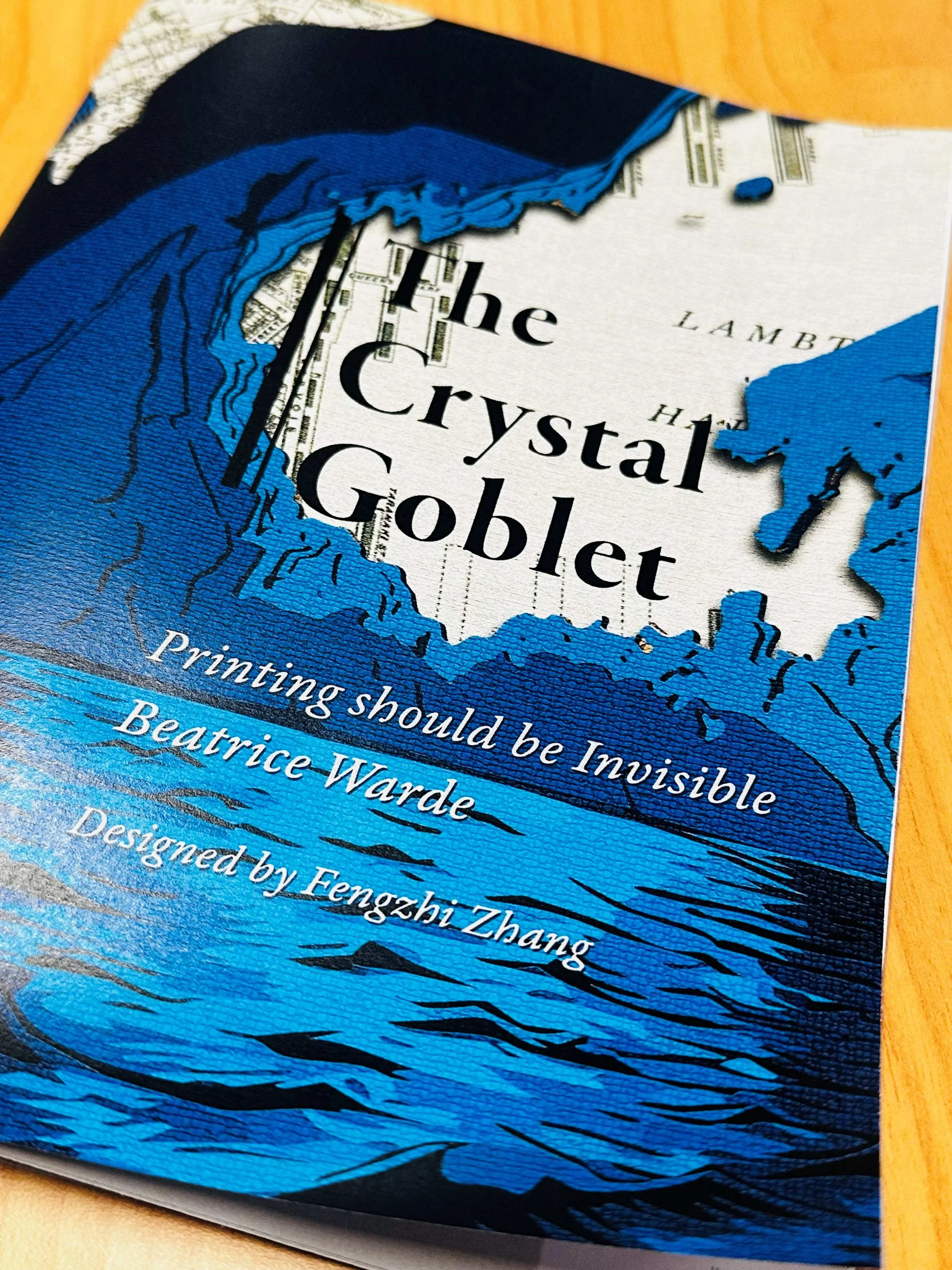
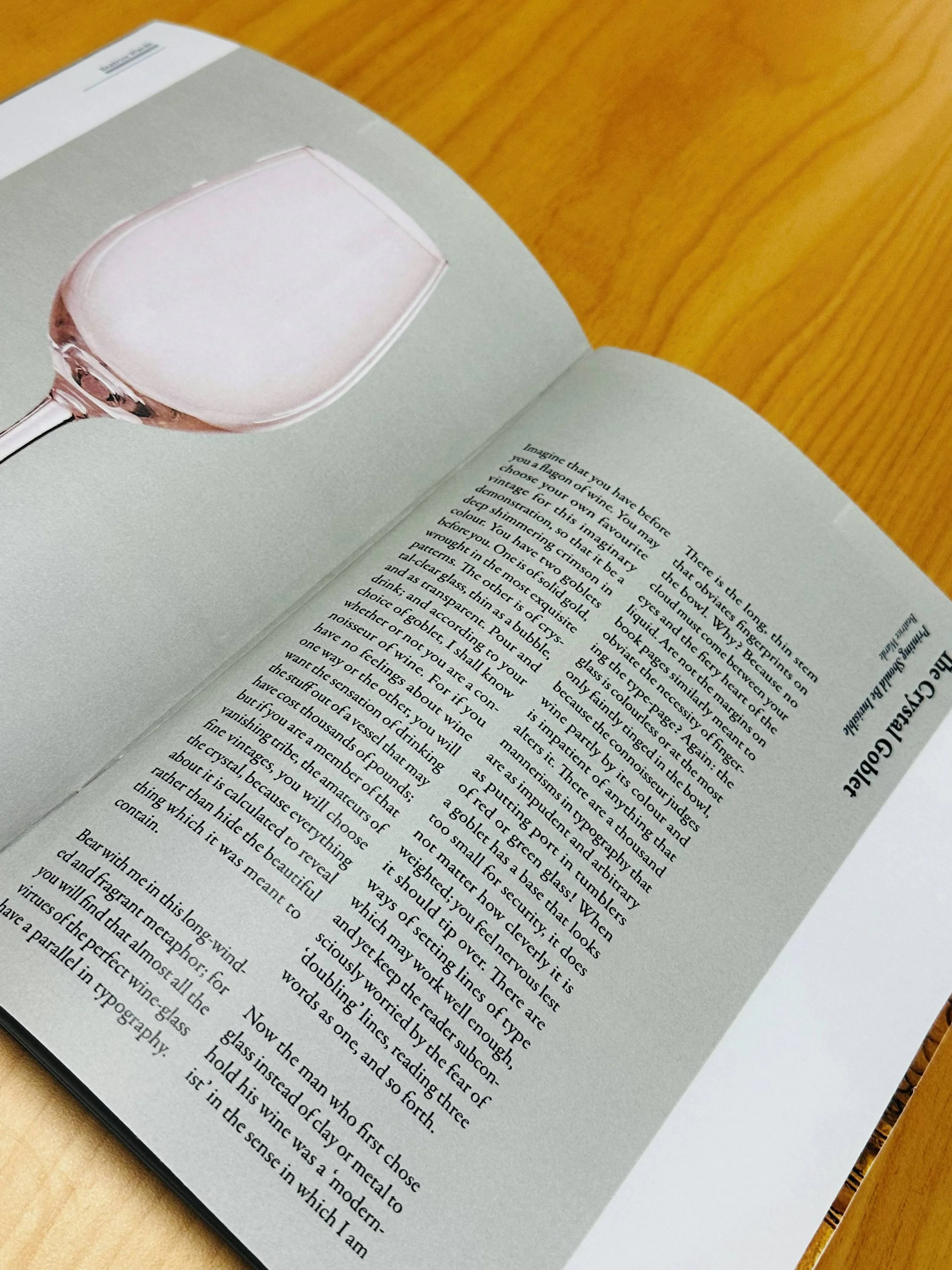
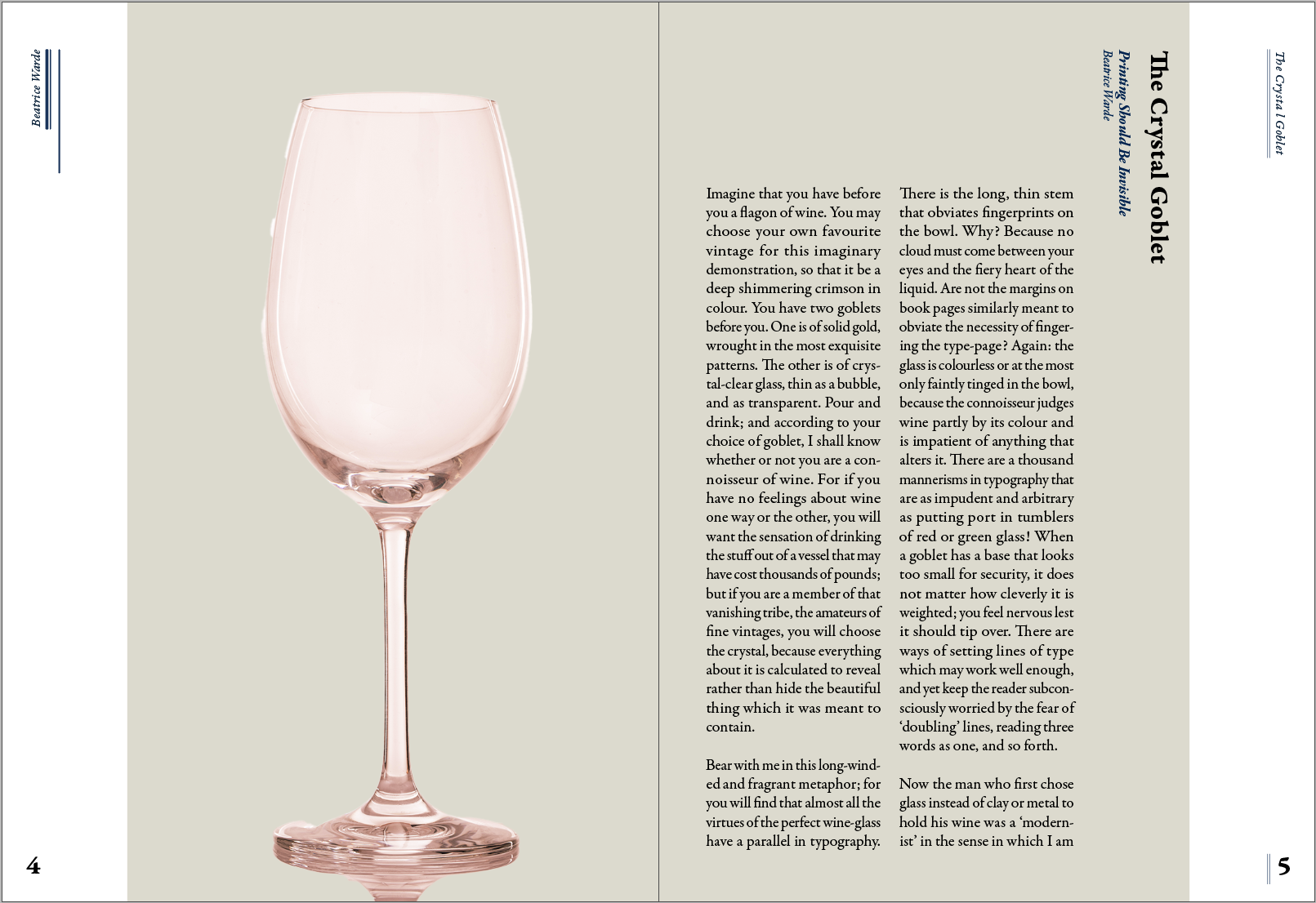
This design uses Garamond Premier as the typeface, an Old Style serif, giving it an elegant, vintage quality. This font has a handwritten influence, offering comfortable reading without drawing much attention to itself, reflecting the idea of the “crystal goblet” in typography. I chose this typeface because it also matches the historical tone of the essay, which was written in 1932, and helps reinforce a more classical and literary visual atmosphere. The type family offers a range of weights and styles, including italics and bold variations, which create an effective visual hierarchy for distinguishing titles, subtitles, captions, and main text.
The composition is structured using a 6 × 6 column-based grid, creating consistency and strong structure across the page. This predominantly vertical alignment helps maintain readability while allowing generous negative space and a more breathable layout on the top and the edges of the pages.
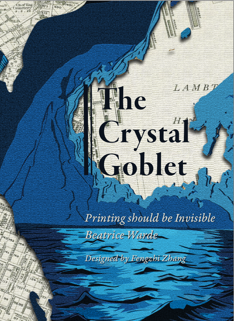
To introduce a greater sense of rhythm and variation, I added several vertical lines with different weights combined and aligned to the grid. These help add visual movement while still maintaining a structured composition. The colour palette was chosen to connect with the cover design, using dark blue and creamy white to create continuity and a cohesive visual identity throughout the booklet.